Professional English I: Skill 4: Introduction to Effective Communication: Writing
Transferring of Information
Solved examples, Practice Exercises | Professional English
The letters or figures arranged in the code form convey certain meaning to us.
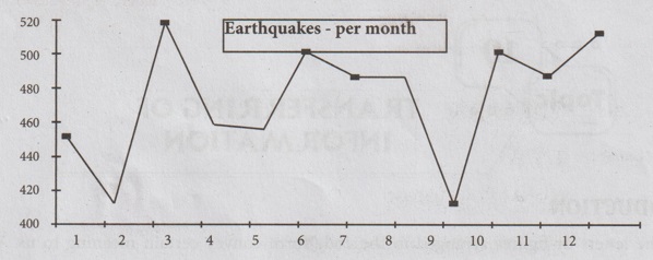
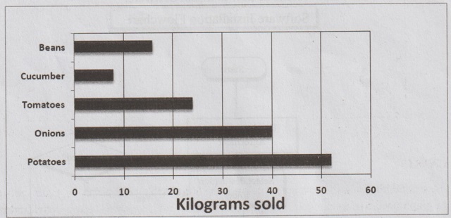
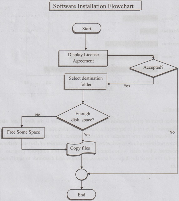
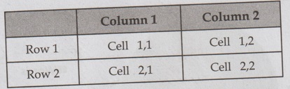
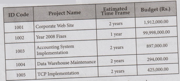
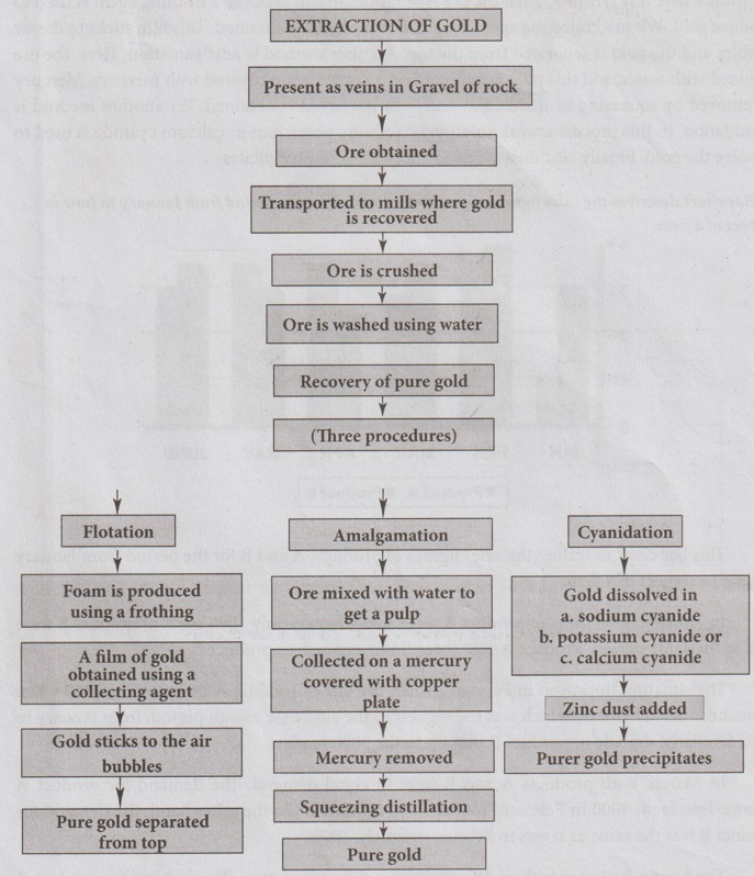
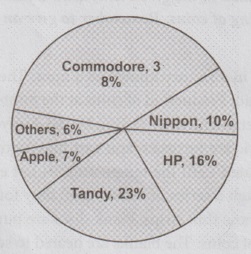
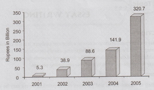
Topic - 10 TRANSFERRING OF INFORMATION The letters or figures arranged in the code form convey certain meaning to us. When the meaning of such codes is decoded in the written form in a descriptive manner it is called transcoding or interpreting. Any set of symbols that communicates meaningful messages is a code. A language is a set of symbols and hence it is a code. Graphs(Line Graph, Bar Graph), Flow charts, Pie charts and Tables are all set of symbols and are codes, too. Graphic aids make communication easy to understand. ● Take a good look at the given chart and table ● Understand the meanings of the code symbols. ● Interpret and infer messages from the figures or pictures. ● Prepare a rough draft. ● Put these messages in logical continuity. ● Compare and contrast variables. ● Begin the paragraph with a topic sentence, and follow it up with sentences that help to expand, explain, elaborate, exemplify. Line Graph A line graph is a way of depicting graphically how two quantities are related, and how they vary relation to one another. A second kind of graphic representation is the bar chart, or bar graph. It is very common kind of graph used to depict levels of a qualitative, independent variable using individual bars. It consists of an axis and a series of labeled horizontal or vertical bars with different values. The numbers along one side of the bar graph is the scale. Look at the below sample of a simple bar chart. It gives you at a glance a comparison of the number of defects reported in cars manufactured in three factories. The factory is an independent variable, since it does not have a unit of measurement. The dependent variable is scalar and is measured in defects / 1,000 cars. Look at a second example of a bar graph, with horizontal bars. The bar chart shows the weight in kilograms of a day's sale in a local vegetable market. We can see that 52 kg of potatoes, 40 kg of onions, 24 kg of tomatoes, 8 kg of cucumber and 16 kg of beans were sold. Another form of representation that is widely used today is the flow chart, also known as a flow diagram. It is used to represent a process that takes place in successive stages, as in a production process from raw material to finished product. Flow.charts can be used to show at a quick glance not only industrial processes but also others consist of clear successive stages. In a restricted sense, a flow chart is the sequence of operations in a computer program. There are conventions for the use of the shapes of squares, rectangles and diamonds to signify each step of the program Look at the flow chart below. It tells us how to Install Software. PIE CHARTS Another kind of chart is the circle chart or pie chart. It consists of a circle divided into sections, each showing the size of some related piece of information. Pie charts are used to display the sizes of parts that make up a whole. Here is a sample pie chart. The chart shows that body language is the most powerful element in our communication and is followed by the tone we use when we speak and write. Words, apparently, play only a very small role in our communication. Look at another sample. The pie chart below shows the Population of countries of the European Union in 2007 by percentage. A simple form of graphic representation is the table, in which data are arranged in horizontal rows and vertical columns that carry labels to identify what they represent. Look at the template for a simple table below. Table caption Here is a project table which contains information about the scheduled time frames and allocated budgets for a company's ongoing projects. Other tables we commonly come across are train schedules and rate cards. 1. Flow-chart of extraction of Gold The flow chart describes the method of extracting pure gold from its ore. Generally gold is present as veins in gravel or rock. From them the ore is obtained. The impure ore is transported to the mills where it is crushed. Then the ore is flotation. In this process, a frothing agent is used to produce gold. When a collecting agent is used, a film of gold is obtained. This film sticks to the air bubbles and the gold is separated from the top. Another method is amalgamation. Here, the ore is mixed with water, and this pulp is collected on a copper plate covered with mercury. Mercury is removed by squeezing or distillation and then pure gold is obtained. Yet another method is cyanidation. In this process a weak solution of sodium, potassium or calcium cyanide is used to dissolve the gold. Finally zinc dust is added and pure gold precipitates. 2. Bar chart describes the sales figures of products, A and B for the period from January to June in respect of a firm. This bar chart describes the sales figures of products A and B for the period from January to June in respect of a firm. In January, 3000 units of product A were sold whereas only 1000 units of product B were sold in the same period. Product A sold three times as much as product B. The situation improved in February when the sale of product A increased by 1000 when it touched the 4000 mark, which was the highest in the entire six month period, from January to June. Similarly, the sale of product B shot up to the 3000 mark. In March, both products A and B were in equal demand. The demand for product A became less, from 4000 in February to just 3,000 in March. On the other hand, the demand for product B was the same as it was in February namely, 3000. The figures for the month of April present a different picture. The demand for product A further decreased to about 2600 whereas the demand for product B was more than what it was in March. The demand for product A further diminished while the demand for product B further increased. The month of May shows appreciation in demand for both the products. The sale of Product A increased to 3000 what it was in January, while the sale of product B was above the 3000 mark, the highest during the period January to June. In June, product A experienced a further rise in its sale, well beyond 3000, next only to what it was in January but the sale of product B for the first time showed a decreasing trend, but still firm at 3000, what it was in February. The bar chart shows that the maximum sale of product A was in February when it touched the 4000 mark, whereas the maximum sale of product B was in May, when it was above 3000. It was a big leap from 1000 in January. 3. Production of Passenger Cars in India This table is about the production of passenger cars in India, in 2014-15 and 2015-16 by Hindustan Motors, Premier Automobiles, Maruti Udyog, Standard Motors and Sipani Motors. The table highlights the extremities in the production of passenger cars, with Maruti Udyog ranking first and Standard Motors and Sipani Motors stopping their production altogether in 2015-16. The production of passenger cars by Hindustan Motors was 28.293 in 2014-15 and it rose to 28.730 in 2015-16 showing an increase of 437 cars. It shows that the demand for their cars increased in 2015-16. Similarly, there was an increase in the production of cars by Premier Automobiles, their figures being 38,293 and 42,313 respectively, with an increase of 4020 cars. But Maruti Udyog excelled them all with its figures in six digits, 1,08,023 in 2015-16 compared with 98,505 in 2014-15, increasing its production by 9518 cars. It indicates that during this period people had the greatest preference for Maruti cars. It might be due to price, fuel economy, size, maintenance, resale value, etc. It is sad to think of Standard Motors and Sipani Motors whose production was ‘Nil in 2015-16. Even in 2014-15 their production was the lowest (172 and 85). It shows that their cars were no longer in demand. Perhaps the growing popularity of Maruti cars sealed their fate. 1. Study the following carefully and write a paragraph. 2. Convert the following flow-chart of Hierarchical set up of the employees of a company into a paragraph of about 150 words. 3. Study the following table and make a paragraph. 4. Look at the following pie chart, which shows the splitting of the office supplies for a month. Write a paragraph presenting the information contained in the chart. 5. Using the information provided in the given text, draw a flow-chart. Education is broadly classified into three categories. They are school education, collegiate education and higher education. This division is based on the level of education. Next, school education is divided into two branches namely, elementary education, and secondary and higher secondary education. On its part, collegiate education is branched into three parts. They are: Arts and science education, professional education and education given by polytechnics and special institutions. Further, professional colleges are sub-divided into medical colleges and paramedical colleges, agricultural and veterinary science colleges, law colleges and engineering colleges. As far as engineering education is concerned, it has manifold branches such as civil, mechanical, electronics and communication, electrical and electronics engineering and computer science engineering. 6. The following is the age-wise readership of Sunday Morning, a pictorial weekly. Present the above data in the form of a. a pie graph b. a bar graph 7. Using the information provided in the given text, draw a flow chart describing the different stages involved in the making of coins. Remember to give an appropriate title to your flow chart. Coins are manufactured in a factory known as a mint. There are three mints in India: in Bombay, Calcutta and Hyderabad. Production of coins at the mints is a complete process. It starts with the buying of unmixed metals and their testing by the Assay Department. Then the metals are alloyed in oil-fired or electric are furnaces, and cast into ingots 40cm wide, 15cm thick and 6m long. These ingots are reheated until the temperature is hot enough for hot rolling. During this stage, the ingots pass through a series of rollers until they form long, thin sheets which are the thickness of a coin. From these thin strips, blank discs are punched. These are the basic raw materials for the manufacture of coins. The blanks are heated to soften them, and they are rolled so that the rim is raised. Finally they are stamped with the design of the coin. At every stage, defective pieces are carefully sorted out, and (with the frequent checking and returning points) strict quality control is maintained. Rejects are returned to the alloying stage, together with the waste from the alloy strip. 8. Study the following table and describe in a paragraph. 9. Look at the following pie-chart, which shows the production of computers in a percentage. Write a paragraph presenting the information contained in the chart. 10. Study the following bar chart which shows the total amount of foreign investment involved in India. Write a paragraph presenting the information contained in the chart.INTRODUCTION
Procedure for decoding charts and symbols.
GRAPHS
BAR CHARTS

FLOW CHARTS


TABLES
SOLVED EXAMPLES


Practice Exercises


Professional English I: Skill 4: Introduction to Effective Communication: Writing : Tag: : Solved examples, Practice Exercises | Professional English - Transferring of Information
Related Topics
Related Subjects
Professional English I
HS3151 1st semester | 2021 Regulation | 1st Semester Common to all Dept 2021 Regulation